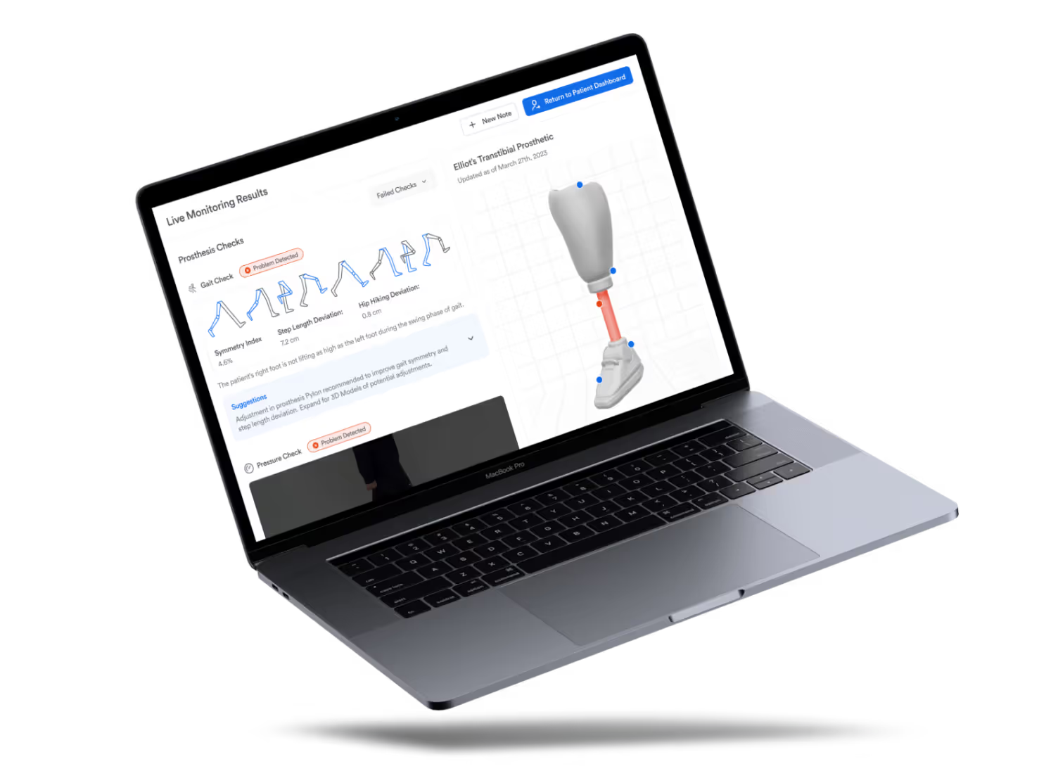
Synchronic
Our vision for improving long-term outcomes for prosthesis patients.
Project highlights
Synchronic is our vision for improving long-term outcomes for prosthesis patients by addressing throughput problems with practitioners. It’s a holistic revision of the prosthesis adjustment experience.
If you're interested in playing with the prototype, you can view it right here (on desktop). If you’re interested in what I learnt from participating, keep reading!
Getting started
The everyday prosthesis user fights with a pain-point-filled value chain to get their artificial limb working right. Even worse, the endless cycle of appointments and waiting lists keeps repeating if the prosthesis is even slightly off. And that's assuming there are enough care providers to go around in the first place.
For the capstone project of my final year at the University of Waterloo, my team and I built Synchronic to address the largest chokepoint in that chain. We partnered with Rogers 5G Create Lab to research, develop, and pitch an interactive prototype that leverages digital twins to secure better long-term outcomes for prosthesis users without dramatically increasing time or monetary costs.
UX Research, UX Testing, Agile Project Management, Business Modelling & Strategy
- 5 students, working as UX Researchers, UX Designers, Business Strategists, and Project Management
- Rogers 5G Create Lab
- University of Waterloo Motion Research Group
Final grade of 93%, Invite to showcase at Stratford Symposium
The problem
We quickly brainstormed some ideas and burned through the basics of ideation.
9 in 10 prosthesis users lack access to prosthetics due to cost, availability, and personnel
In 2017, the WHO estimated that there were 35-40 million people worldwide who required the use of prostheses. 9 in 10 of these users struggle with issues like:
Users stop using their prostheses due to factors such as comfort, lack of function, or repair and maintenance availability.
Prostheses typically last a short amount of time due to varying load requirements, wear rates, or body change.
Users are advised to leave prosthesis adjustment to professionals, but frequently there aren't enough practitioners to promptly make these adjustments.
Groundwork
First, we used a How-Might-We (HMW) statement to guide our thinking about potential solutions for the problem space.
A small research detour on digital twins and 5G technologies also contributed to a better foundational understanding:
Taking cautious first steps
In Canada, research on prosthesis patients requires official ethical clearance. In order to meet our deadline without skimping, we conducted 8+ interviews with family doctors, health students, and a University of Waterloo research group, whose expertise served as a proxy for the insights we wanted to learn.
Take Inventory
The tools that care providers use are undermining their ability to give top-notch care.
Here we discovered the real problem. There are sufficiently advanced technology and facilities to provide and maintain care, but care providers are still struggling with old, unintuitive software tools that get in the way of optimal patient-practitioner communication.
Distilling our findings
Putting the research into a user needs statement helped us decide on features for the prototype MVP.
Product Design
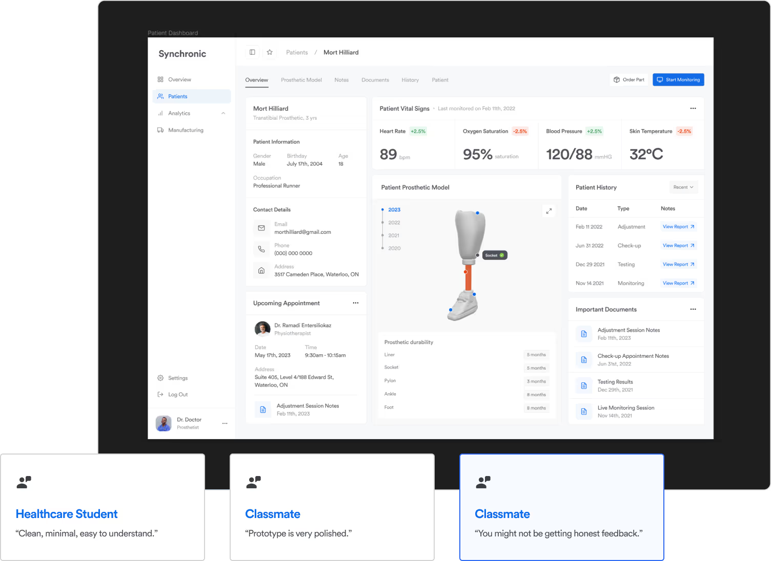
The first version of our concept was based on exploration of existing health management software. We had one main goal in mind: to simplify the dashboard and surface the relevant data. Since we’d already completed so much secondary research, we thought it would be relatively straightforward and decided to skip testing the wireframes (a mistake).
With our basic prototype developed, we tested our understanding by conducting in-class usability tests. Unfortunately, however, there were problems with our first draft.
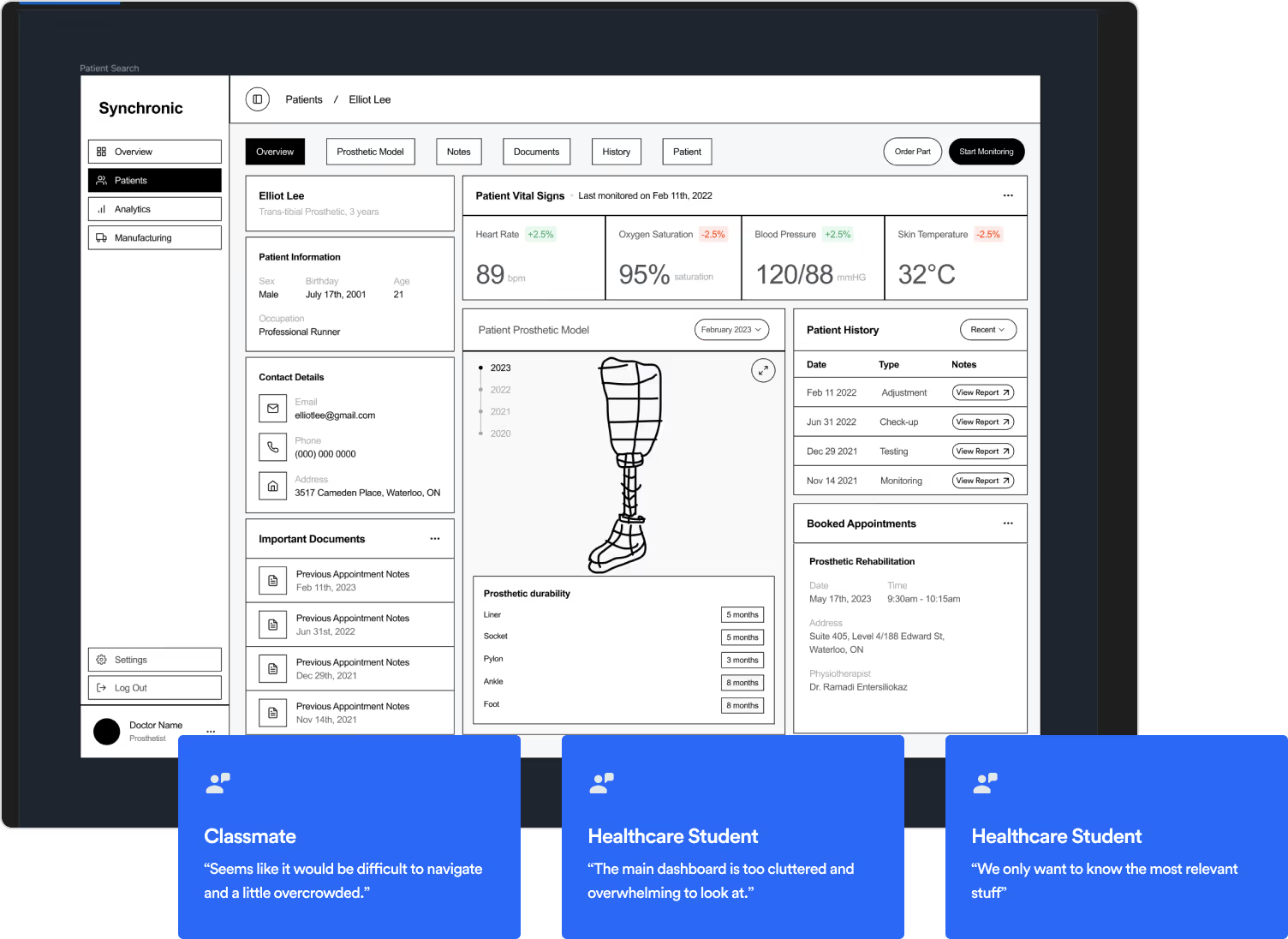
80% of testers reported difficulty navigating. "There's too much information" and "I don't know which subpage to click on" were commonly noted.
Peers mentioned that the level of visual fidelity might intimidate testers into withholding their honest feedback about other usability aspects.
Revising structure and flow
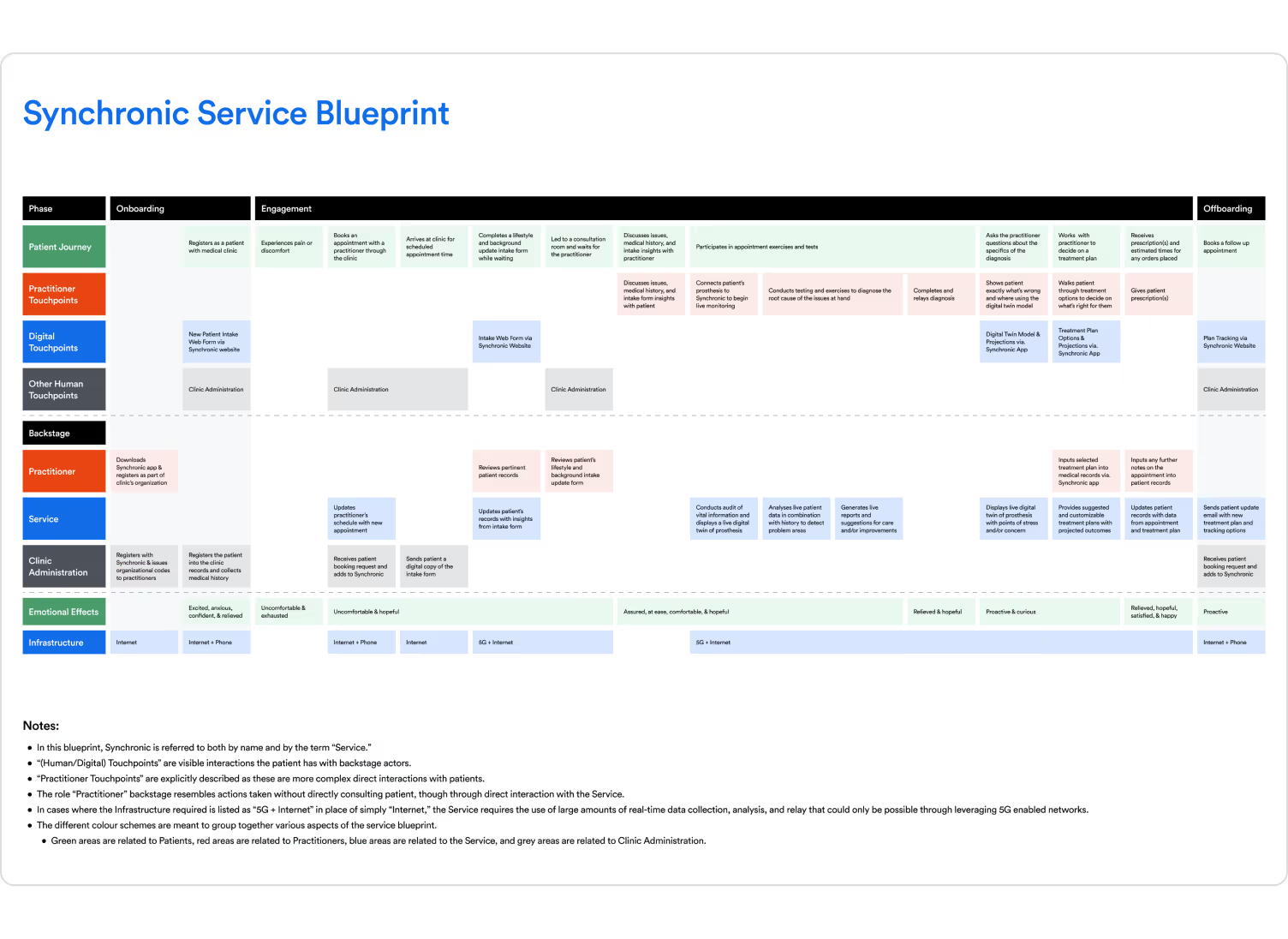
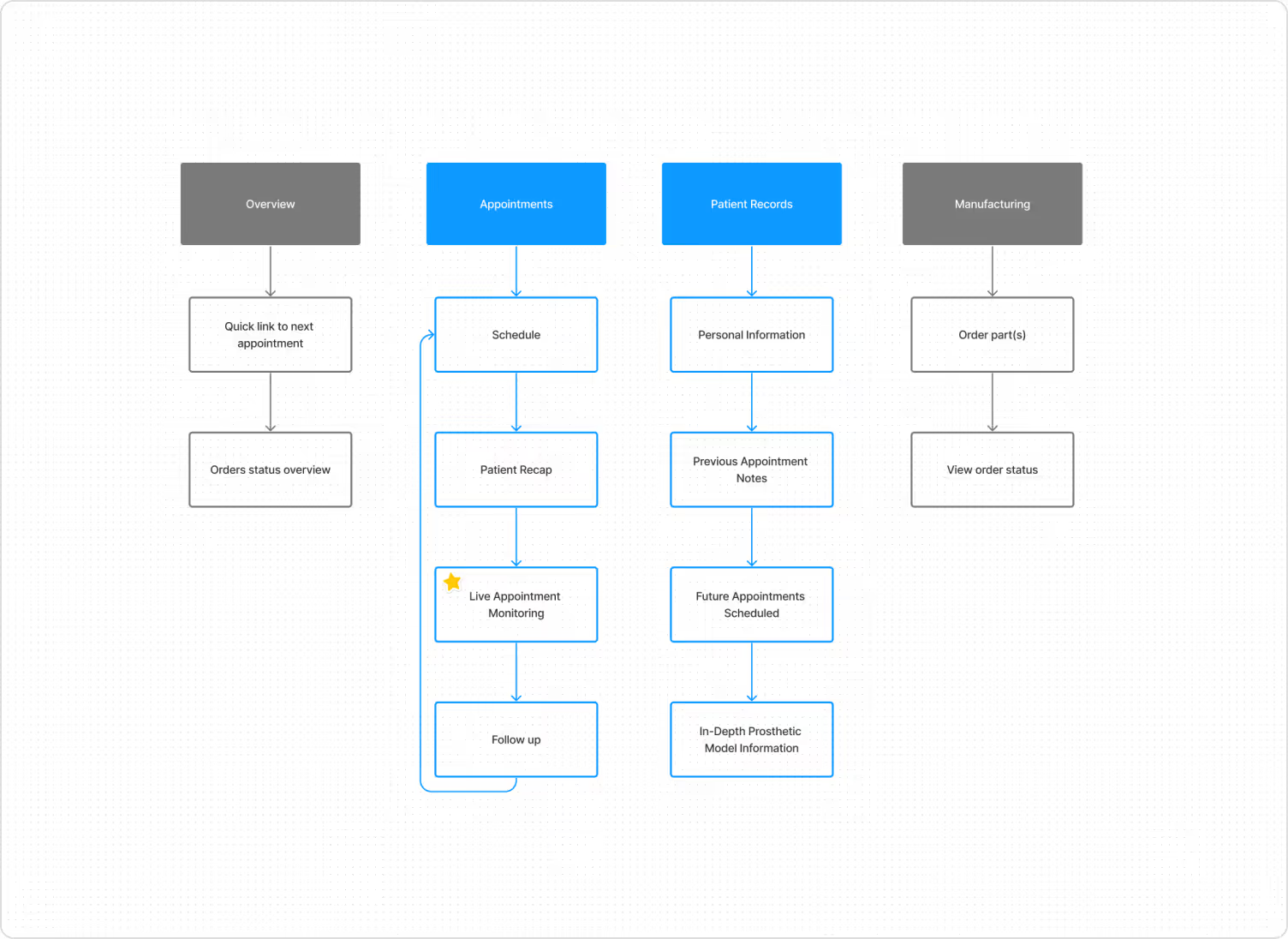
Our MVP features only appear at one section of appointment. Thus, we decided to restructure our UX flow and information architecture to better match the customer service blueprint touchpoints.
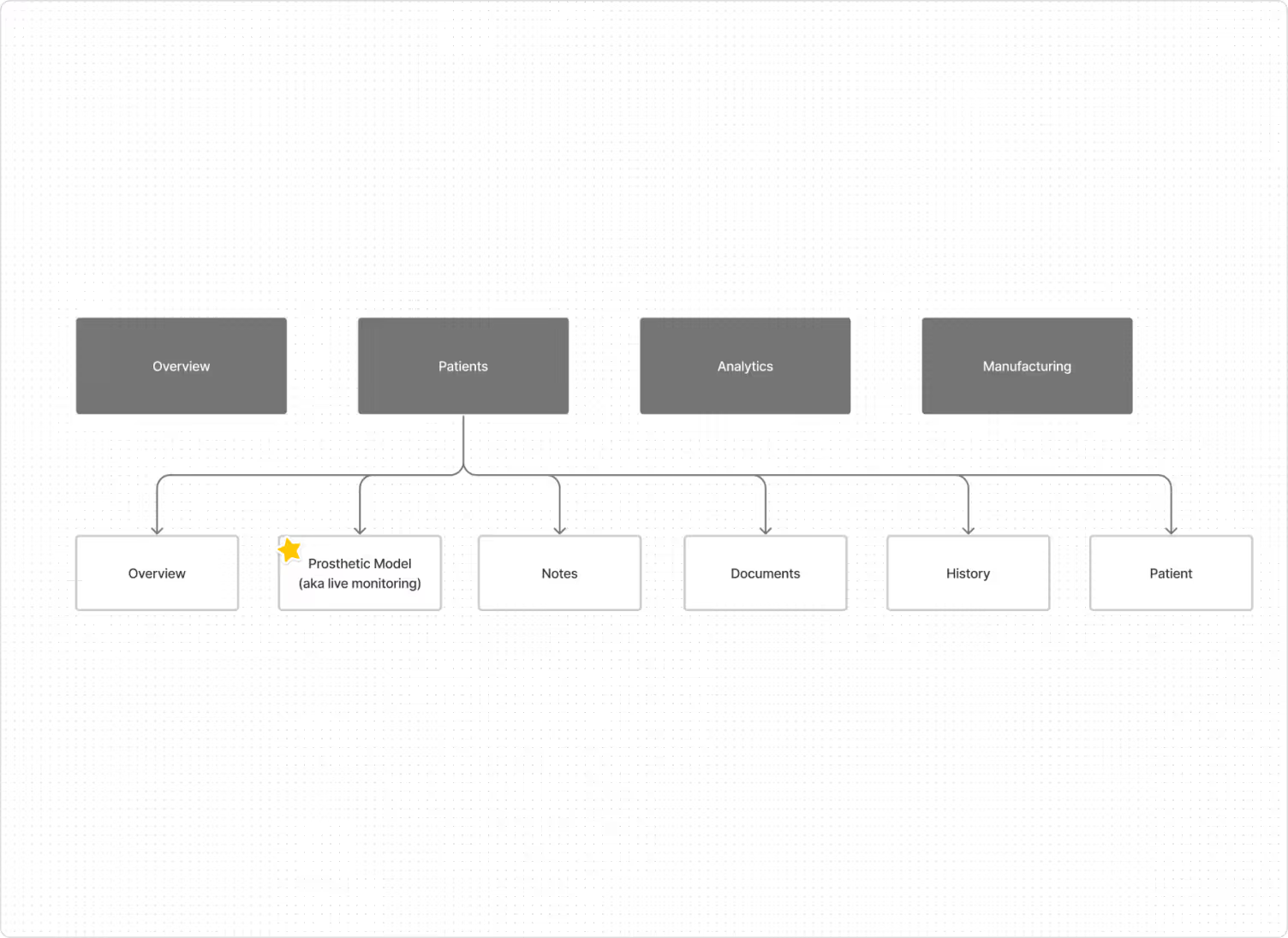
Shifting our architecture to mirror the flow of a real-life appointment helps us concentrate MVP features in one area as well as reduce the required number of pages.
Tweaking fidelity for feedback
Reducing the fidelity of our prototype also helped to increase the volume of feedback we received, even given the same content and architecture.
Validation with further testing
Having generated more practitioner-centric knowledge of the appointment workflow, our team could confidently take the low-fidelity screens to high-fidelity.
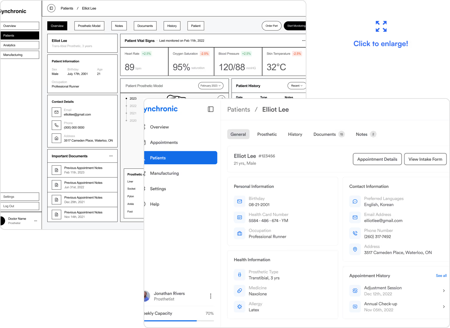
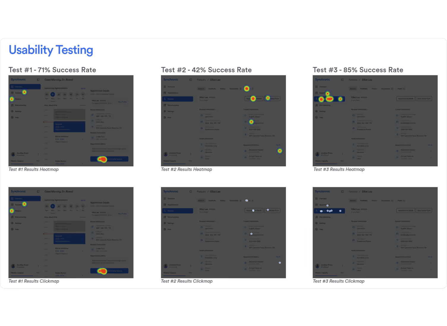
We also linked these screens up using Figma's prototyping functions. By testing, we could verify that our changes would have the correct impact.
Final Designs
After our final round of testing, we presented the pitch (alongside our MVP!) You can give it a try here (desktop only), or scroll through the main experience flow:
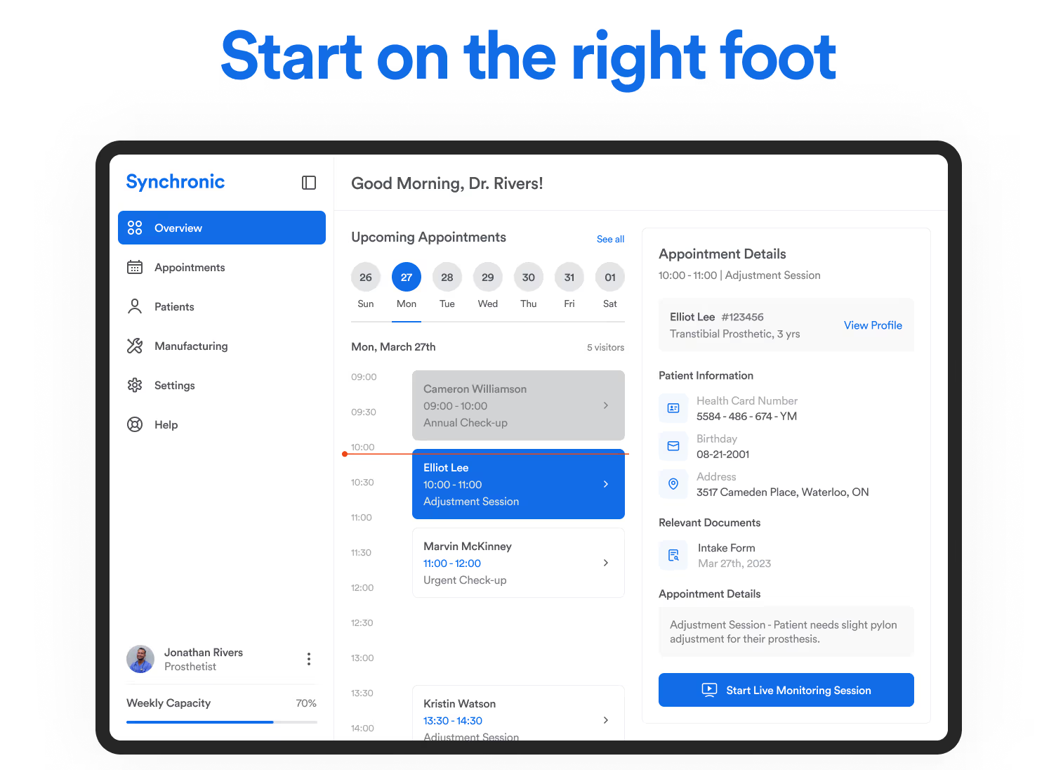
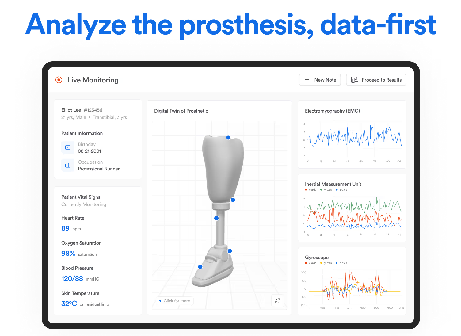
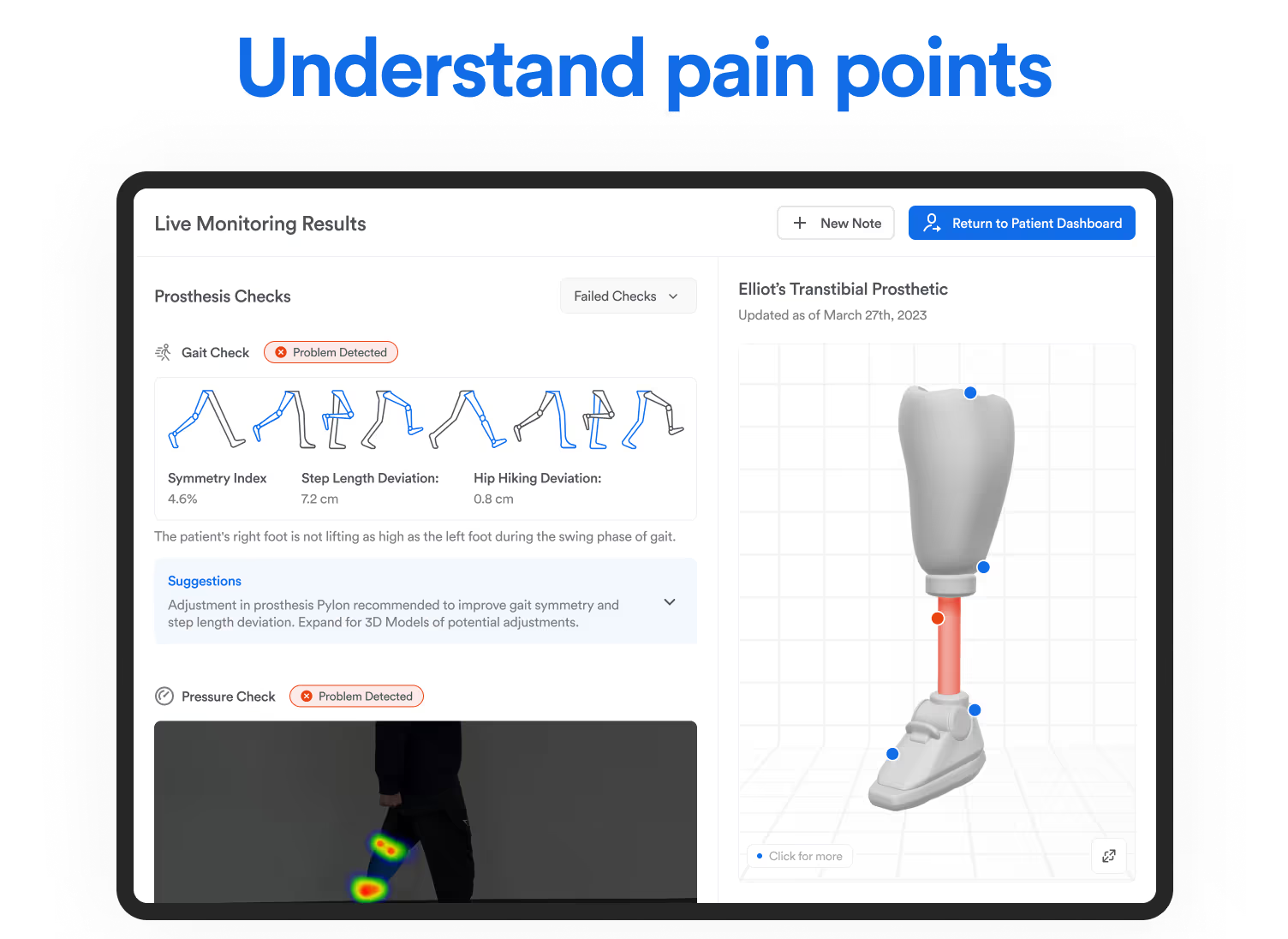
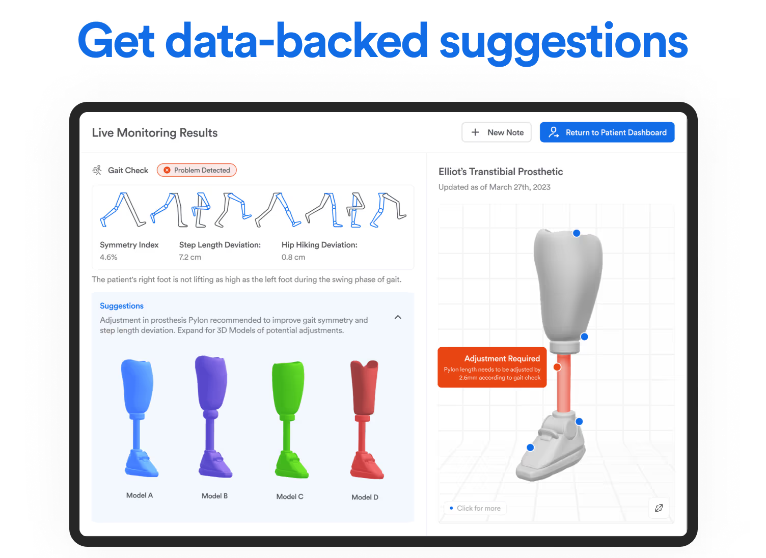
At every step of the appointment, we precisely deliver essential data for generating insights, letting care providers focus on the patient, not the data collection.
Results
Thanks to the hard work of our team, the final demo pitch was a resounding success! Besides achieving a final grade of 93% and being informally awarded best-in-class project, our team was also invited to present our project and pitch to Stratford School stakeholders.
“The execution of this idea is brilliant! I would have liked to see you guys take this even further by pitching it to investors.”
This project was also very fulfilling on a personal level! I got to dabble in project management, exercise my user experience research skills, and refine my collaboration workflow. To that end, I'm really interested in further exploring project management because supporting my teammates and seeing them excel was my favorite part of this project!
Conclusion
This project taught me many lessons about my attitude as a designer, researcher, and manager.
We relied on heuristics to fill the gaps of our secondary research and thought we could skip some of the "grunt work". Turns out, low-fidelity prototypes are crucial for checking your understanding of foundational concepts! Having discipline saves you (and the team) lots of repeated work.
Our project's intermediary tasks changed many times as we juggled the project's vision and the data from our research. Using a project management tool helped me stay on top of the big picture, which helped me direct my team and time-manage appropriately (staying flexible).
There's a huge body of work out there! Using proxies for the first time helped me realize that my communication skills were the barrier to many unexpected sources of knowledge. It's difficult to get the right answers if you aren't humble about who you can learn from.
Once again, thanks to my team and everyone at the university for making this project possible! If you're interested in more details about the project or myself, feel free to get in touch.


